Making it easier for club members to handle activities
March 2022 – duration: 5 weeks
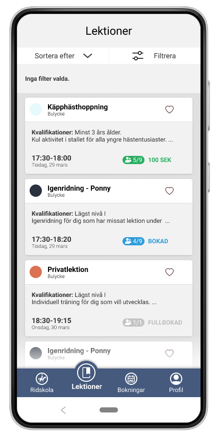
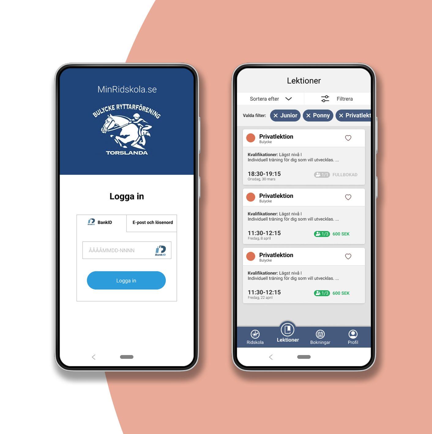
Min Ridskola.se is a booking service used by club members at riding schools all over Sweden. The service lacks a good user experience and the goal of this case study was to explore user needs and I learned which changes are fundamental to meet the user’s needs.
Scroll down to see the process!

The challenge
MinRidskola.se is part of Xenophon, a leading administrative program system used by riding schools all over Sweden. Xenophon administers over 30,000 lesson riders every week as well as 1,000,000 sessions, 100,000 invoices and 900,000 logins per year.
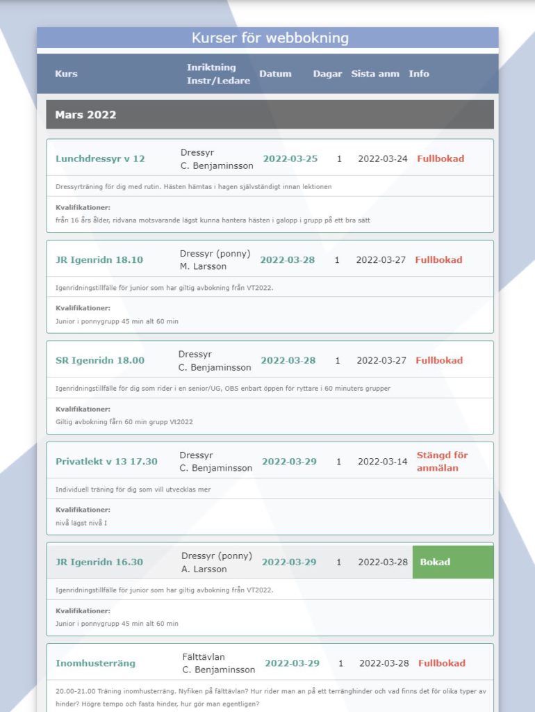
The main task of the project was to improve the experience of booking activities through MinRidskoa.se. Looking at the excisting homepage (below) it is outdated and quite difficult to interact with.
During the course of the project, I looked at competitors and different solutions for booking and filtering functions. I found out the users’ pains & gains through interviews, group discussions, SUS-scale and Heuristic Evaluations.
The process
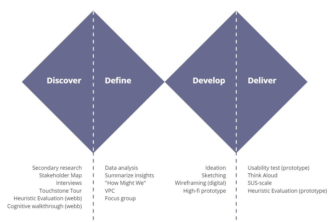
I followed the process in the Double Diamond and used methods that I considered relevant to the project objectives (see image below).
Research
During my research i found a handful of different digital tools for stable operations. I also got inspired by different types of e-commerce and booking systems in other industries, such as gym, food, fashion and beauty.
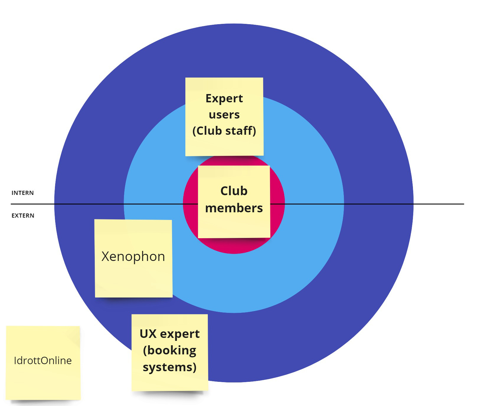
My target group was the club members. But to understand the different stakeholders around the service I created a stakeholder map and found other interesting stakeholders to talk to through my research, such as expert users (club staff) and UX experts within booking systems. These three aspects was a good source for triangulated data and I interviewed them all.
Interviews and observations
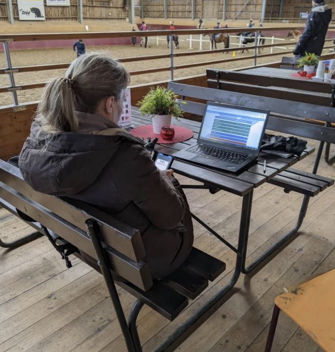
I conducted a total of nine interviews; seven club members, one expert user of MinRidskola.se (the stable manager) and one product designer working with digital booking systems. All interviews were voice recorded, in order to avoid taking notes, and made me focus on the conversation.
What I learned;
- Club members primary use the service to reserve or cancel riding courses.
- Club members primary use the service on their mobile phone.
- Users experience a lack of overview.
- Users find it difficult to navigate.
- It should be easy to sort and filter what you are looking for.
- Prioritize the most common things – what users often do.
- You should receive recommendations based on your interests.
- Make it possible to highlight favorites or follow your interests.
- Users gets frustrated by the poor performance of the service – it crashes when many people use it at the same time.
” There are too many clicks to get where I want.”
– Club member
Sketches
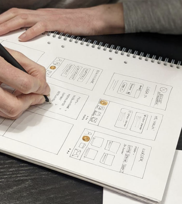
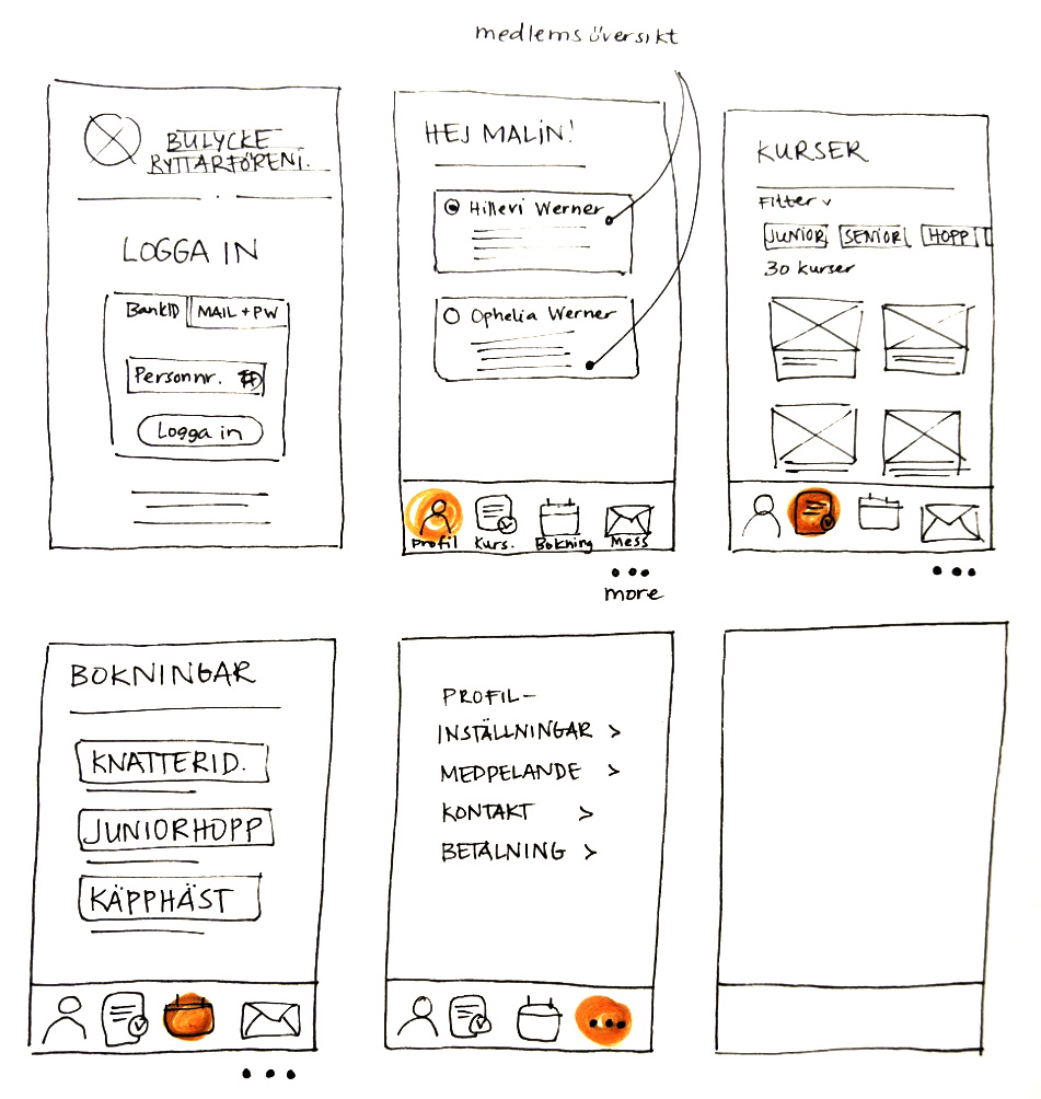
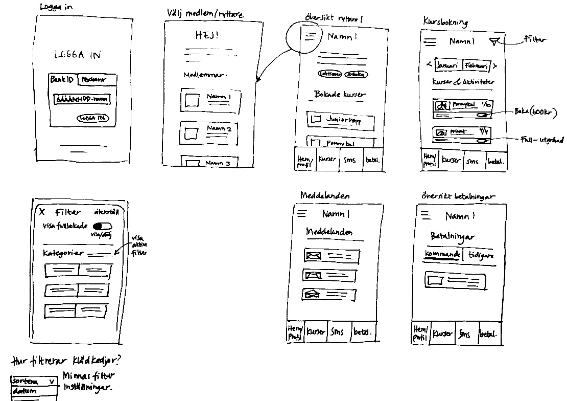
To get ideas out of my head, I started sketching wireframes on paper. I went back to my research and my interviews to formulate different solutions to the users pains. I didn´t want to invest time in Figma at this early stage. The goal with the sketches was to create a low-fi prototype and discuss it with a number of club members. In this group discussion I wanted to look for solutions to the problems that emerged during my interviews.
Wireframes and prototypes
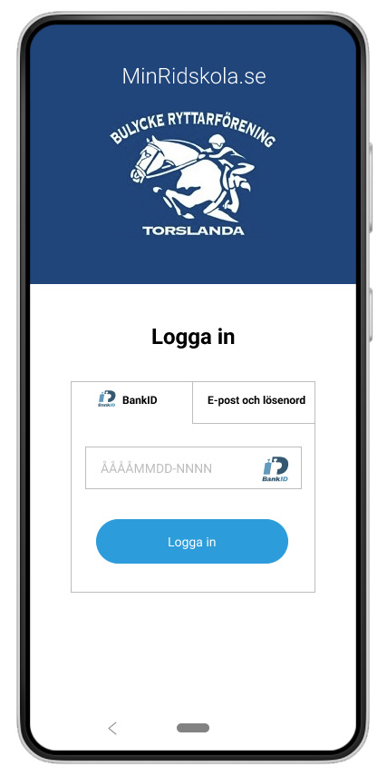
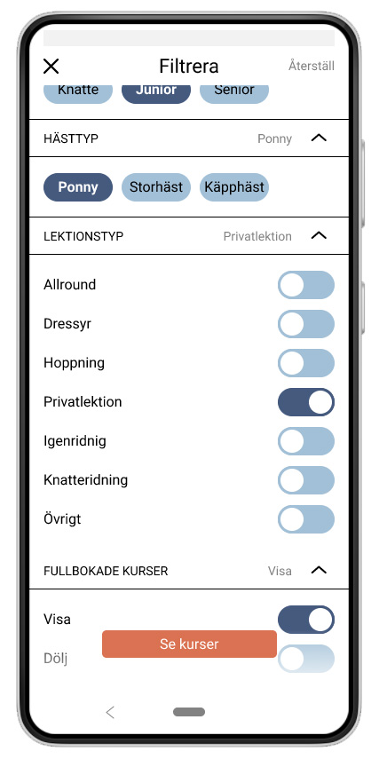
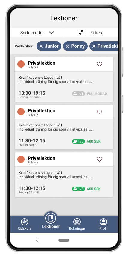
I created wireframes in Figma with some simple geometries and worked my way with the details. The biggest challenge in prototyping was to create the filtering function. Here I got a lot of inspiration from my research and tips from interviews with the club members.
Result from usability test – webb vs prototype
I invited three members, who use the web service on a regular basis, to test my prototype. They were given a number of tasks to complete and I encouraged them to think aloud. At the end of each test, I asked some overall questions about the experience.
To be able to compare the experience from the web service and my prototype I conducted a survey for the SUS-scale after each test. My goal for a successful project was to score 80 or better on my prototype. See the result in the picture below.
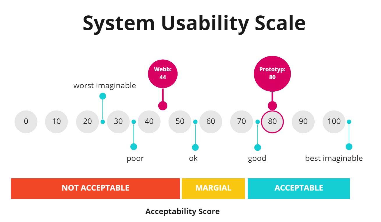
Results from the final test; the original webb service got a total score of 44 = Not acceptable. The prototype got a total score of 80 = Acceptable.
Learnings
#1 Interviews
I noted that club members I asked to participate in the interviews gave more general and overall answers, unlike the people who volunteered via social media. Those who volunteered used the service more regularly and had deeper opinions and thoughts about improvements. One woman I talked to also became very tensed about me recording the conversation, which I think affected her response and the conversation overall.
#2 Scope of work
During the second iteration in Figma, I became aware that the prototype was becoming too complex. At this stage I looked back at my HMW and it helped me narrow down my prototype and stick to the main purpose.

